
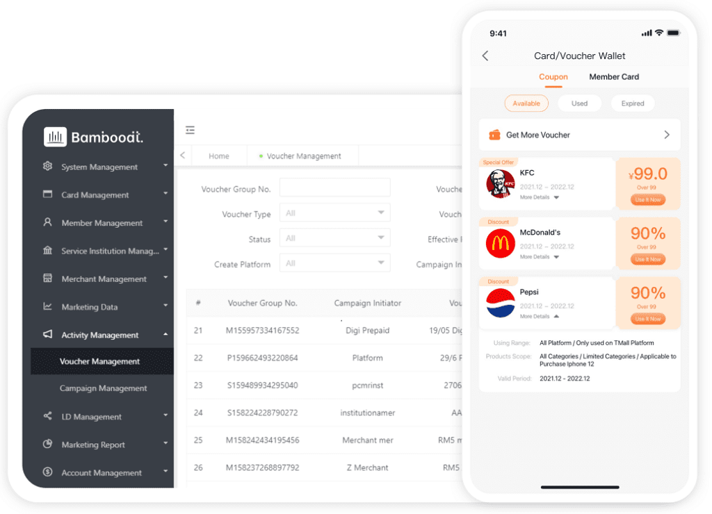
In the rapidly evolving landscape of web and software development, user interface (UI) design plays a pivotal role in shaping user experiences. Among the myriad of UI components, “cards” have emerged as a versatile and popular element that encapsulates information succinctly and aesthetically. Whether it’s for showcasing products, articles, user profiles, or interactive elements, card-based designs allow developers and designers to present content in a clean, organized, and responsive manner.
The Evolution and Significance of Card UI
Originally inspired by the physical card elements used in traditional print and board games, digital cards have transitioned into a fundamental building block in modern UI/UX design. They serve as self-contained units that can include images, text, buttons, and other interactive elements. The modularity of cards makes them ideal for building scalable and consistent interfaces across various devices and screen sizes.
Google’s Material Design guidelines, followed by many UI frameworks, have formalized the concept by defining principles for card design, emphasizing touch-friendly, flexible, and visually appealing components. The significance of card UI lies in its ability to enhance content discoverability, improve user engagement, and streamline interactions by compartmentalizing information.
Design Principles for Effective Card UI
1. Clarity and Simplicity
At the core of a successful card design is clarity. Every element within the card should serve a purpose. Avoid cluttering the layout with unnecessary information or decorative elements that distract from the main message. Use whitespace judiciously to create breathing space around elements and improve readability.
2. Visual Hierarchy
Establish a clear hierarchy to guide users’ attention to the most critical parts of the card. This can be achieved through size, color contrast, typography, and positioning. For example, a prominent product image paired with bold titles naturally draws attention first, followed by secondary details such as descriptions and action buttons.
3. Responsive and Adaptive Layouts
Cards should adapt gracefully to various screen sizes and orientations. Employ flexible grid systems, media queries, and scalable assets to ensure that cards look appealing on desktops, tablets, and smartphones. Vertical stacking or horizontal scrolling can be employed to enhance usability on smaller devices.
4. Consistency and Brand Cohesion
Use consistent styling, color palettes, fonts, and shadow effects across all cards within a project to achieve a cohesive look. Incorporate brand-specific elements such as logos or color schemes to reinforce identity and trustworthiness.
5. Interactive Elements
Incorporate interactive components such as buttons, hover effects, and animations to make cards engaging. Micro-interactions provide feedback, enhance usability, and encourage user actions like clicking, favoriting, or sharing.
Practical Implementation: Building a Modern Card UI
HTML Structure
<div class='card'>
  <img src='product-image.jpg' alt='Product Image' class='card-image'/>
  <div class='card-content'>
    <h2 class='card-title'>Product Name</h2>
    <p class='card-description'>Brief description of the product that highlights key features and benefits.</p>
  </div>
  <div class='card-actions'>
    <button class='btn-primary'>Buy Now</button>
    <button class='btn-secondary'>Learn More</button>
  </div>
</div>
CSS Styling
.card {
  max-width: 300px;
  background-color: #fff;
  border-radius: 8px;
  box-shadow: 0 2px 8px rgba(0,0,0,0.1);
  overflow: hidden;
  display: flex;
  flex-direction: column;
  transition: box-shadow 0.3s ease;
}

.card:hover {
  box-shadow: 0 4px 12px rgba(0,0,0,0.2);
}

.card-image {
  width: 100%;
  height: auto;
}

.card-content {
  padding: 16px;
}

.card-title {
  font-size: 1.25em;
  margin-bottom: 8px;
}

.card-description {
  font-size: 0.9em;
  color: #555;
}

.card-actions {
  display: flex;
  justify-content: space-around;
  padding: 12px 16px;
  background-color: #f9f9f9;
}

.btn-primary {
  background-color: #007bff;
  color: #fff;
  border: none;
  padding: 8px 16px;
  border-radius: 4px;
  cursor: pointer;
  transition: background-color 0.2s ease;
}

.btn-primary:hover {
  background-color: #0056b3;
}

.btn-secondary {
  background-color: transparent;
  color: #007bff;
  border: 1px solid #007bff;
  padding: 8px 16px;
  border-radius: 4px;
  cursor: pointer;
  transition: background-color 0.2s ease, color 0.2s ease;
}

.btn-secondary:hover {
  background-color: #007bff;
  color: #fff;
}
Trends and Innovations in Card Design
Modern card design is continuously evolving, embracing new technologies and user preferences. Some notable trends include:
- Neumorphism: Soft UI designs that create a tactile, almost physical feel by using subtle shadows and highlights.
- Glassmorphism: Using semi-transparent backgrounds and vivid border effects to produce a frosted-glass appearance.
- Micro-animations: Subtle animated feedback within cards, such as hover effects, loading indicators, and transition animations, to enhance interactivity.
- Vertical and Horizontal Scrolling: Leveraging scrollable card Carousels for efficient use of space and interactive browsing experiences.
- Personalization: Dynamic content rendering based on user preferences or behaviors, making each card more relevant and engaging.
Accessibility Considerations for Card UI
Designing accessible cards is essential to ensure inclusive user experiences. Considerations include:
- Providing sufficient color contrast between text and backgrounds.
- Using semantic HTML elements and ARIA labels to improve screen reader compatibility.
- Ensuring that interactive elements like buttons are keyboard navigable.
- Providing alternative text for images.
- Designing responsive layouts that are easy to read and interact with on all devices.
Integrating Card UI in Modern Development Frameworks
Popular frameworks and libraries facilitate the creation of sophisticated card components:
- React: Component-based architecture allows reusable, stateful card components with props for customization.
- Vue.js: Templates and directives enable dynamic data binding within cards, supporting interactive and live content.
- Angular: Material Design components include pre-built card modules with extensive options for customization.
- Bootstrap: Provides a robust set of card classes that streamline responsive, styled cards with minimal effort.
By leveraging these frameworks, developers can implement complex, animated, and data-driven card layouts efficiently, reducing development time and maintaining consistency across projects.
Conclusion
While the article requests no explicit conclusion, it’s evident that thoughtfully designed card UI components are indispensable in modern software and website development. They enhance user engagement, simplify complex information, and provide aesthetic flexibility. Staying abreast of design trends, accessibility standards, and technological innovations ensures that your cards remain functional, attractive, and inclusive.


