
In the rapidly evolving world of web and software development, user experience (UX) remains paramount. As users become more accustomed to modern interfaces, designers and developers seek innovative ways to present information that is both appealing and easy to navigate. One such trend that has gained remarkable prominence is the utilization of card-based interfaces. These visually distinct, modular components serve as a powerful approach to organizing, displaying, and interacting with content. This comprehensive guide explores the ins and outs of designing and implementing engaging card-based interfaces in software and website development, ensuring your projects resonate with users and elevate your user engagement metrics.
Understanding Card-Based Interfaces: What Are They?
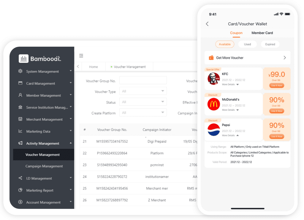
Cards are rectangular or square containers that encapsulate related information or functionality. Borrowed from physical card concepts, digital cards aim to present chunks of content in a compact, attractive, and digestible manner. They are versatile, adaptable, and can seamlessly integrate images, titles, descriptions, buttons, and even multimedia content. Iconically, platforms like Pinterest, Twitter, and Google Now have popularized this design paradigm, making it an integral part of modern web and app interfaces.
The Advantages of Using Cards in UI/UX Design
- Modularity and Flexibility: Cards are inherently modular, enabling developers to create fluid layouts easily adaptable to different screen sizes and devices.
- Organized Content: They help segregate information clearly, making complex data more approachable.
- Visual Appeal: Well-designed cards can dramatically enhance aesthetic value, leading to improved user engagement.
- Interactivity: Cards facilitate user interactions like clicking, hovering, and swiping, enriching the overall experience.
- Responsive Design Compatibility: Due to their adaptable nature, cards are a cornerstone of responsive web design frameworks.
Design Principles for Effective Card Interfaces
To maximize the potential of card layouts, certain design principles should be observed:
- Consistency: Maintain uniformity in card size, shadow effects, typography, and spacing to provide a cohesive look.
- Visual Hierarchy: Use color, size, and positioning to emphasize essential information.
- Clarity: Ensure the content within each card is concise and easy to understand.
- Whitespace: Adequate spacing prevents clutter and improves readability.
- Interactivity Cues: Use visual cues such as hover states or animations to indicate clickable areas.
Tools and Technologies for Creating Card Components
Developers can leverage various tools and frameworks to build robust card components:
- CSS Frameworks: Bootstrap, Material-UI, Tailwind CSS offer pre-designed card components with customization options.
- JavaScript Frameworks: React, Angular, Vue.js facilitate dynamic card creation and interaction handling.
- Design Tools: Figma, Adobe XD allow precise UI designing and prototyping of card layouts prior to development.
Implementing Card UI: Step-by-Step Approach
Creating an engaging card interface involves several key steps:
1. Planning and Wireframing
Start by sketching out the layout and determining what information each card should contain. Consider the data types, media inclusion, and interaction points. Wireframes help visualize the hierarchy and flow.
2. Designing the Visuals
Utilize tools like Figma or Adobe XD to craft the visual style. Decide on color schemes, typography, shadow effects, and hover states. Maintain consistency with your overall branding.
3. Coding the Components
Translate your designs into code. Use HTML for structure, CSS for styling, and JavaScript or frameworks for interactivity. For example, a simple card can be coded as:
<div class="card">
  <img src="image.jpg" alt="Sample Image">
  <h2>Card Title</h2>
  <p>Brief description of the card content.</p>
  <button>Learn More</button>
</div>
4. Making It Responsive
Use media queries or flexible grid systems to ensure cards render elegantly across devices, from desktops to smartphones.
5. Adding Interactivity and Animations
Enhance engagement with hover effects, click animations, or swipe gestures, especially for mobile applications. Frameworks like Animate.css or custom CSS transitions can be utilized.
Best Practices for Performance and Accessibility
- Optimize Images: Compress images for fast loading without sacrificing quality.
- Semantic HTML: Use appropriate tags to improve accessibility for screen readers.
- ARIA Labels: Assistive technologies benefit from descriptive labels for interactive elements.
- Keyboard Navigation: Ensure cards can be navigated via keyboard for inclusivity.
- Lazy Loading: Load images and content as needed to improve performance.
Case Studies: Successful Card Implementations
Many industry-leading websites and applications employ card-based designs to boost engagement:
Pioneering a grid of visually appealing cards, Pinterest allows users to discover and save ideas effortlessly. Their dynamic loading and infinite scrolling make browsing seamless.
Google Now
This intelligent assistant displays information in card formats, ranging from weather updates to travel itineraries, providing quick access to personalized content.
Posts are displayed as cards with images, comments, and likes, making content digestible and inviting user interaction.
Responsive Strategies for Card Layouts in Modern Web Development
Responsive design is crucial to cater to an increasingly mobile user base. Techniques include:
- Grid Systems: CSS Grid or Flexbox enable flexible card arrangement.
- Media Queries: Adjust card sizes and number per row depending on viewport width.
- Adaptive Content: Display less content or use collapsible components on smaller screens.
Future Trends in Card UI Design
Looking forward, several exciting trends are shaping the future of card-based interfaces:
- Microinteractions: Small, subtle animations within cards to enhance user engagement.
- Personalization: Dynamic content tailored to individual user behavior.
- Neumorphism and Glassmorphism: New aesthetic styles adding depth and translucency to cards.
- Voice and Gesture Integration: Making cards interactable via voice commands or gestures, especially on mobile and wearable devices.
Summary
Building engaging card-based interfaces requires a blend of thoughtful design, technical proficiency, and user-centered thinking. From crafting consistent visuals to ensuring responsiveness and accessibility, each step contributes to a compelling experience. When implemented effectively, cards can transform complex data into appealing, easy-to-navigate collections that captivate users and enhance overall satisfaction. Embracing current best practices and staying attuned to emerging trends will help developers and designers create innovative, effective card interfaces that stand out in the crowded digital landscape.


